Tempo Move. Vision, Process, Hustle.


Rarely does a project come along that combines our design ethos, point of view, and keen interest in smart furniture and wellness products. Meet Tempo Move — the first of a new generation of accessible in-home health equipment. With our partners at Tempo, this project challenged us to transcend the limited vision of what fitness equipment could be. 

In 2018, we began our partnership with Tempo on their original in-home fitness product, Tempo Studio, building a strong collaboration dynamic that enabled us to work together smoothly, generatively, and extremely quickly on their latest product.


Move was imagined, designed, and manufactured in just five months—a supersonic speed compared to the classic design process.


Although the design language of Move entailed a shift from the original Tempo design, it wasn't a completely new project, it was part of an existing ecosystem that we knew inside and out.

With the introduction of Move, Tempo continues a series of successes in the industry. level's partnership with Tempo began when they were just 2 founders working off a first raise of $1.8 million. Since 2019, the San Francisco-based company has been the recipient of almost $400 million in VC funding and was valued at $250 million in 2020. As of late 2021 it has more than tripled its valuation, received an IDEA award and was recognized twice by Fast Company for innovation. The Tempo Studio received widespread praise, and with Move as its latest offering, Tempo is positioned at the forefront of home fitness tech advancements to come.


the brief

In June of 2021, the Tempo team approached us with an urgent request for a secret new product. We met directly with the CEO and VP of hardware to be briefed. Taking the success of the original Tempo Studio as a jumping-off point, they envisioned a more affordable alternative that leveraged user’s existing TVs and iPhones to cut out its large, expensive screen. By taking advantage of new developments in spatial mapping technology, an iPhone and well-positioned dock could replace the 3D cameras/sensors—making the cost more accessible while significantly reducing environmental impact. Multiple features were key to this vision: 

- An affordable price point, allowing even more people to use Tempo 

- Reduced product size, enabling it to fit in smaller living spaces

- Made for entry-level, as well as advanced, users

- A material and color palette that evokes the aesthetics of home furniture, not gym equipment.

On top of all these constraints, the client proposed a very tight schedule: we had to move from sketching, to the testing and validation stage in a shockingly tight five months. To put this in perspective, a typical product development timeline may run anywhere from a year or two, and beyond. But since we’d worked with the Tempo team before, we knew our strong rapport would make this high-speed turnaround achievable.


the constraints

Move is a true pioneer in the at-home fitness world, leveraging the latest advancements in spatial mapping and recognition technology. Move puts the user’s iPhone to use as the body and weights sensor capturing the user’s form and relaying feedback in real time. It’s also able to detect which weights are being used based on color. The iPhone connects directly to any TV to display the guided workouts. These innovations cut out the need for a system with integrated cameras and displays. 

At the heart of Move is an iPhone dock, named The Core. It’s removable, so users can place it on their existing media furniture or in a convenient location near their TV. It also charges phones while they’re plugged in, ensuring that workouts won’t be interrupted by dying batteries.


Move had to be able to live in a range of environments, so we considered how to optimize its footprint in living rooms, small apartments, and other spaces, both in size and appearance.


To work with its HDMI hookup, Move would be positioned in proximity to a TV, at a fixed height that enabled an accurate field of vision. That led us to investigate furniture that conventionally filled that space, including credenzas, side tables, and hi-fi audio, for design inspiration.

Finally, Move would incorporate the following equipment components:

- Four each of 1.25-pound, 2.5-pound, and 5-pound weight plates (Four 10-pound weight plates, sold separately, are also designed to fit into the console.) 

- Two dumbbells 

- Four weight collars

- A heart-rate monitor

- The Core, a removable dock, which includes a phone backstop, HDMI cable and port, and a charging dongle


Although this is Move’s final list of elements, at the beginning of the design process, many of the specifics were evolving in real time. Requirements around dimensions, cable selections, styles of phone, angles of view, and more would continue to change through the months ahead.


a collaborative process

A June kick off to a November launch is unheard of—especially during a global pandemic! 

Because of the project’s fast pace, almost none of the initial design brainstorming was done through our traditional digital process. Instead, in-person collaboration sped things along. The Tempo team came directly to our studio to see sketches, cardboard mockups, and raw photos. We even cut up and built models in front of them. 

After California lifted pandemic restrictions and opened back up, we brought 16 people from the Tempo team into our studio. This included their: trainers, marketing and digital teams, the supply chain director, the VP of hardware, and the founders. With all of us in the same room, our thinking could evolve quickly. 

Moving at a pace faster than anything deemed “typical” or even “aggressive” in the design world, we turned around multiple design directions in the very first week, including different architectures for storage of Move’s essential elements. By the end of June, we’d built full-scale cardboard models and drawings. From there, the Tempo team narrowed down the options into a shortlist, which we used as a springboard to iterate ideas and design details. 


Physical mockups were an essential tool that allowed us to envision how Move could fit its component parts.


By the end of the first month, we’d created 20 cardboard variations of Move, including its weights and dumbbells, all designed and built to ensure we were iterating realistically around scale and accessibility. We focused on accommodating smaller spaces, using photos of level’s and Tempo team members’ own living rooms.


the details

Move couldn’t be purely aesthetic; the details would also determine how users picked up and returned the weights and dumbbells. Since Move is designed for those new to workouts, we had to keep in mind that its users might not be physically strong—or have confidence in using gear. To protect our users, access to the weights had to be safe, easy, and ergonomic. 

As we reviewed the user experience, we considered the constraints around the original Studio’s doors. Since they were metal, they required clearance for opening and closing to avoid interference with surrounding furniture, walls, and doors. To address this, we came up with the idea of magnetic flexible fabric doors that could be opened and tucked away between small spaces.


the final push

By early August—just three months along in the process—we were selecting woods, powder coats, and textiles. With no time to wait for samples, we drove to vendors ourselves to collect their internal references. We carried reams of fabric and piles of swatches to Tempo’s offices, unpacking across workspaces and hoisting options up for review, and often gathering a crowd as selections ensued.

With a pivotal board meeting approaching in mid-September, we opted to create a set of appearance models that would help the client visualize the final product.


The modeling process would also invite us to think more granularly about Move’s final details.


For example, the fabric on the models had a great weight, feel, and quality, so it was handed over to production. Additional aspects of the product were also adjusted, including the matteness of the powder coat and the wood grain. Even seemingly minor details, like the tabs on the fabric door, received close attention. 

As soon as the Tempo team approved our models, we moved into production. Conveniently for us, the contract manufacturer and model-makers were in the same city. This meant they were able to work in real time together, reviewing findings, and sharing material and finishing samples. The manufacturing team visited the model shop in person to see how the appearance models were made, which helped them understand the nuances of user details and achieve higher aesthetic quality. This parallel process also allowed us to keep pace with our timeline by eliminating multiple final revisions. The production team saved time in making their own trial attempts, since the model-makers passed on all the necessary information about how the details, forms, and finishes should look and work. 

After five months of day-in, day-out work on planning, design, and production, Move was ready—right on time for its November launch.


the outcome

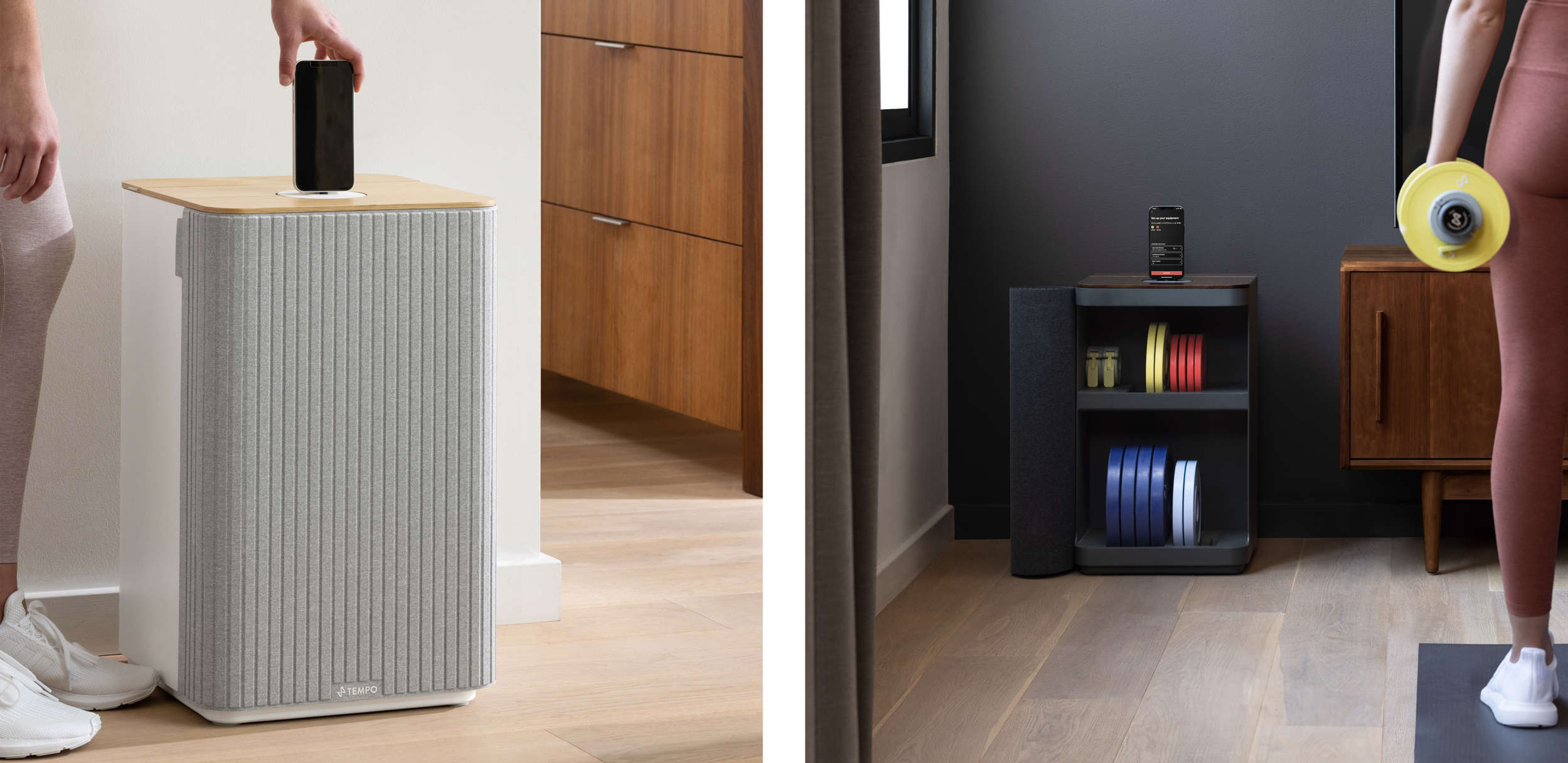
Contoured and inviting, Move is unlike anything you would find in a home gym. From the first glance, Move’s furniture-inspired textiles and wood set it apart from traditional workout  equipment and make it a natural addition to the home environment. 

We intentionally departed from the look of weight racks, which typically feature unfinished pieces of extruded black metal with prominent welding scars. For our design we asked our manufacturers to grind down welding scars and carefully powder coat the metal in inviting colors. To improve on the usual sticky, shiny gym vinyl, we opted to use upholstery fabric, just like you would pick out for your sofa. We also steered away from the sterile industrial colorscape of black, opting to offer the Move in both a light and a dark palette.


The warmth of natural materials and textiles makes Move both tactile and homey. 


Weights and dumbbells are concealed within the door, allowing the Move to blend into its environment. A thoughtful interior houses the weights vertically, with grooves distributed finger-width apart for easy grabbing. The soft chamfer on the tray allows weights to roll in smoothly, with just enough room along the edge to stash a couple of Tempo’s weight collars or a heart-rate monitor. This intuitive organizational schema keeps things neat and guides users to return the weights safely and comfortably.

A wood lid floats above the body of the Move unit. Discreet tabs show users how to hinge the back portion open, revealing the cavity that houses the dumbbells. Simple friction holds the back open during use. The dumbbells sit upright in a tray, which is cast in rubber to ensure that taking and returning the dumbbells leaves minimal scratches and is easy, even after a hard workout when your arms feel like Jello.

The removable aluminum Core comes with a rubber base and top, so it can sit as easily on a media console or credenza as on Move itself. Its round shape lets you swivel your phone to the right position to capture your workout, while the sliding backrest ensures the phone is secure. The soft, approachable bent sheet-metal body unifies the Move with the language of Tempo’s original Studio. Hidden interior channels route the cable that connects the TV to the Core, so there’s no chance of a tangle, and little rubber feet on the Move’s base protect your floors while also raising the door’s height just the right amount to slip over your carpet as you open it.


world, meet Move

The growing trends of in-home health equipment and smart furniture mean more and more of us can work out from home. With the revolutionary Tempo Move, the gym doesn’t need to come home with us, either.


Thanks to its soft, appealing home-décor look and compact size, Move fits both aesthetically and spatially into homes of all kinds, from city studios to cottages and beyond.


And with a notably low price point, we hope to empower those who can’t afford a larger fitness unit to embrace at-home workouts. Even for those new to weights and exercise, Move’s sophisticated movement-tracking technology and intuitive storage make it easy to improve health in the home. We’re proud of what we’ve accomplished in our five-month sprint with Tempo, and of the way Move has harnessed both technology and design to make wellness dreams a reality.


Like what you’ve read? Is it helpful? Let us know, and feel free to share, via LinkedIn.